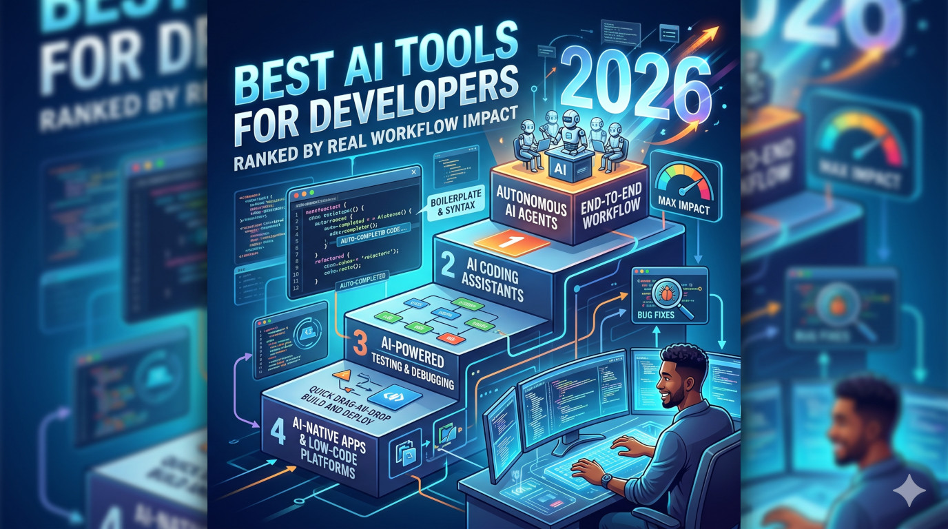
Category: AppReview

  • DashPane Review 2026: Is This the Best macOS App Switcher

    Honest, in-depth review of DashPane — the lightning-fast app switcher that replaces Cmd+Tab for macOS power users.


    Quick Verdict

    Rating: ★★★★★ (4.9/5)

    DashPane is a $4.99 one-time purchase that transforms how you switch between apps on Mac. If you use Cmd+Tab more than a few times a day, this will save you hours every year.

    Pros:

    • Lightning-fast fuzzy search
    • Native macOS design (Swift, not Electron)
    • Keyboard-first workflow
    • One-time $4.99 (no subscription, ever)
    • Privacy-first (no data collection)

    Cons:

    • Limited customization options
    • No window management features

    Best for: Developers, designers, and anyone juggling 10+ windows daily.


    What Is DashPane?

    DashPane is a lightweight, native macOS app switcher that lets you jump between applications in milliseconds. Instead of cycling through apps with Cmd+Tab, you press a shortcut, type a few letters, and instantly switch to your target app.

    Think of it as a faster, smarter replacement for macOS’s built-in app switcher — but one that actually understands how you work.

    Core Features at a Glance

    • Instant Search — Type app name, get instant results
    • 🎯 Fuzzy Matching — “chr” finds Chrome, “cod” finds VS Code
    • 📋 Window List — See every window grouped by app
    • 🖱️ Edge Activation — Scroll corner to reveal all windows
    • 🔒 Privacy-First — No data collection, works completely offline
    • 🍏 Native Design — Built in Swift, not Electron

    It’s built in Swift (not Electron), runs silently in the background, and costs just $4.99 with no subscription — ever.


    The Problem: Why Cmd+Tab Isn’t Enough

    Here’s what happens with macOS’s default app switcher in real-world usage:

    1. You press Cmd+Tab
    2. You see icons cycling in order
    3. You press Tab too many times
    4. You press Shift+Tab to go back
    5. You end up in the wrong app anyway
    6. Repeat 50+ more times today

    This isn’t hypothetical. If you’re a developer, designer, or anyone who works on a Mac professionally, you probably switch between apps 100+ times per day. That’s not an exaggeration — it’s just the reality of modern workflows.

    The Math: Time Wasted on App Switching

    The developers behind DashPane did the math, and the numbers are eye-opening:

    • Default Cmd+Tab: ~2.5 seconds per switch
    • DashPane: ~0.8 seconds per switch
    • Time saved per switch: ~1.7 seconds
    • Time saved daily: ~3 minutes (at 100 switches)
    • Time saved yearly: ~12 hours

    That’s essentially two full work days recovered — just from switching apps faster.

    Imagine what you could do with 12 extra hours in a year. That’s time for:

    • Finishing a side project
    • Learning a new skill
    • Actually leaving work on time
    • Or just not staring at your screen waiting for Cmd+Tab to catch up

    How DashPane Works

    DashPane offers three primary ways to switch between apps, giving you flexibility based on your workflow.

    1. Quick Search (Ctrl+Space)

    This is the primary method and the one you’ll use 90% of the time.

    Press your shortcut (default is Ctrl+Space, but you can change it), type the app name, and hit Enter. Done.

    Real-world examples:

    • Type “chr” → Chrome
    • Type “sl” → Slack
    • Type “ter” → Terminal
    • Type “nv” → Notion
    • Type “cod” → VS Code

    The fuzzy search matches anywhere in the name, so partial matches work perfectly. You don’t need to remember the exact app name — just type a few characters and DashPane figures out what you want.

    2. Window List (Press .)

    Press dot (.) to see every window you have open, grouped by application. This is incredibly useful when you have multiple windows of the same app (like multiple Chrome windows or VS Code projects).

    Instead of cycling through the wrong apps, you can see all your windows at a glance and jump directly to the one you need.

    Use case: You’re working on three different projects in VS Code, and you need to quickly switch to the one with your staging environment. The window list shows you all three and lets you pick exactly which one you want.

    3. Edge Activation

    Move your cursor to either bottom corner of your screen and scroll with two fingers. This reveals a sidebar with all your windows — essentially a quick-access Mission Control without the gesture or keys.

    This is perfect when your hands are already on your trackpad or mouse. It doesn’t replace the keyboard workflow, but it’s a nice supplement for mouse users.


    Key Features Deep Dive

    Fuzzy Search That Actually Works

    Most app launchers and switchers require exact matches or at least matches from the beginning of the app name. DashPane’s fuzzy search is significantly smarter:

    • Matches anywhere in the app name — Type “ph” and find both Phone and Photo Booth
    • Prioritizes recently used apps — Your most-used apps appear higher in results
    • Learns your patterns over time — The more you use it, the smarter it gets
    • Works with partial typing — Just 2-3 characters is usually enough

    Real examples:

    • “ph” → Phone, Photo Booth
    • “cod” → VS Code, CodeKit, TablePlus
    • “mus” → Music, Musictimeline, Musixmatch
    • “nv” → Notion, Nova, Enpass

    This matters because you don’t always remember the exact name of every app you have installed. Fuzzy matching means you can type what you remember and trust that DashPane will find what you need.

    Window List: See Every Window

    The window list (activated by pressing .) is a game-changer for power users:

    • All open windows grouped by app — No more wondering “which Chrome window was I using?”
    • Direct switch to any window — Jump to exactly the window you need
    • Grouped by application — Easier to find what you’re looking for
    • Instant access — Press . and the list appears immediately

    If you’ve ever had 20+ windows open and spent time hunting for the right one, this feature alone is worth the $4.99.

    Native macOS Integration

    DashPane was built specifically for macOS, and it shows:

    • Light/dark mode automatically — Adapts to your system appearance instantly
    • Native styling throughout — Looks like something Apple could have built
    • No menu bar clutter — Runs silently in the background
    • Minimal RAM usage — Won’t slow down your Mac
    • Apple Silicon optimized — Runs natively on M1, M2, M3 chips
    • No Electron — Built in Swift, not a web wrapper

    This matters because some third-party app switchers feel like they’re fighting the OS. DashPane feels like an extension of macOS itself.

    Privacy-First Design

    In an era where every app wants to track you, DashPane is refreshingly privacy-focused:

    • No data collection — Your usage stays on your machine
    • No account required — No sign-up, no cloud sync
    • Works completely offline — No internet connection needed
    • No tracking or analytics — What you do is your business

    This is worth mentioning because some competing apps (looking at you, Raycast) require accounts and have cloud components. DashPane is just… a local app. That simplicity is its own feature.


    User Experience

    Speed

    DashPane is genuinely, noticeably fast. The search popup appears in milliseconds, typing registers instantly, and switching to your app takes less than a second. There’s:

    • Zero lag
    • No loading indicators
    • No spinning wheels
    • No delay between pressing keys

    It feels like a native part of macOS rather than a third-party addition. That might seem like a small thing, but when you’re using it 100+ times a day, every millisecond matters.

    Design

    The design is clean and native. It uses macOS system styling, so it looks like it belongs in your system. Light mode, dark mode — it adapts automatically without you needing to configure anything.

    When the search box appears, it looks like something Apple could have built themselves. No weird gradients, no custom windows that look out of place, no jarring design choices.

    Keyboard-First Workflow

    This is crucial for power users: you can do everything without touching your mouse.

    Full workflow in just 3 keystrokes:

    1. Press Ctrl+Space
    2. Type app name
    3. Press Enter

    That’s it. Never leave the keyboard. For someone who spends most of their day typing, this matters. The less you have to move your hands from the home row, the faster your workflow becomes.


    Pricing: Why $4.99 Is a Steal

    Let’s talk about price because this is where DashPane really stands out.

    Price: One-time payment of $4.99

    That’s it. No monthly fee. No annual subscription. No “pro” tier. You pay $4.99 once, and you own it forever.

    What’s Included

    • ✅ Lifetime license
    • ✅ All future updates included
    • ✅ Priority email support
    • ✅ Works completely offline
    • ✅ No subscription — ever

    Price Comparison

    Compare DashPane to other options:

    | App | Price | Notes | | ———— | ——— | —————————- | | DashPane | $4.99 | One-time, no subscription | | AltTab | $9.99 | One-time | | Contexts | $9.99 | One-time | | Raycast | Free | Requires account, cloud sync | | Cmd+Tab | Free | Built-in, but slow |

    At $4.99, DashPane is:

    • Half the price of AltTab
    • Half the price of Contexts
    • More capable than the free options
    • Cheaper than a monthly coffee

    For what it delivers, the price is almost absurdly low. This feels like Mac software from 2010, not 2026.


    Limitations (Honest Review)

    No app is perfect, and DashPane has some limitations worth knowing about.

    Limited Customization

    You can:

    • Change the keyboard shortcut
    • Choose which corner triggers edge activation

    That’s about it. You can’t:

    • Change the look of the search popup
    • Add custom themes
    • Tweak fuzzy matching sensitivity
    • Customize behavior extensively

    For some power users, this might be limiting. But for most people, the defaults work well out of the box. The developers chose simplicity over configurability, which is a valid design choice.

    No Window Management

    DashPane only switches between apps. It doesn’t:

    • Move windows around
    • Resize windows
    • Snap windows to positions
    • Send windows to different spaces

    If you need window management, you’ll need to pair DashPane with another tool like Rectangle, Rectangle Pro, or similar. The developers explicitly chose to be excellent at one thing rather than mediocre at many things.

    Minor Wishes

    • Window preview before switching would be nice
    • Some users might want more settings
    • Keyboard shortcut customization could be more extensive

    These aren’t necessarily negatives — just things that some users might want.


    Who Should Use DashPane?

    Perfect For:

    • Developers with 10+ apps open daily
    • Designers juggling multiple projects
    • Anyone who hates Cmd+Tab cycling
    • Power users who live in keyboard shortcuts
    • Remote workers switching contexts frequently
    • Content creators managing multiple apps
    • Anyone with a cluttered workflow

    Probably Skip If:

    • ❌ You only use 2-3 apps total
    • ❌ You prefer mouse-based workflows
    • ❌ You need window management (not just switching)
    • ❌ You’re looking for a full productivity suite

    If your dock is always full and you’re constantly hunting for windows, DashPane will change your life. If you have 3 apps open and rarely switch, you don’t need it.


    Comparison with Alternatives

    Why DashPane wins:

    1. Cheapest option for the features
    2. Best native integration
    3. Simplest (no account needed)
    4. Fastest for pure app switching

    FAQ: Common Questions Answered

    Does DashPane work with macOS Sequoia (15)?

    Yes. DashPane is actively maintained and supports all recent macOS versions, including macOS 15 Sequoia. The developer releases updates regularly to keep pace with Apple’s OS changes.

    Can I customize the keyboard shortcut?

    Yes. The default is Ctrl+Space, but you can change it to whatever you prefer in the settings.

    Is it better than Cmd+Tab?

    Overwhelmingly yes, if you switch between multiple apps frequently. The fuzzy search alone makes it worth it. Even if you’re only saving 1-2 seconds per switch, that adds up to hours over a year.

    Does it work with multiple monitors?

    Yes. DashPane works across all your displays and recognizes windows on any connected monitor.

    Do I need to create an account?

    No. No account required. No data collected. Works completely offline. Just download, install, and use.

    Is it better than Raycast?

    For pure app switching, yes — DashPane is faster and doesn’t require an account. Raycast offers more features (file search, workflows, extensions, plugins) but has more overhead and requires cloud sync. If you just want to switch apps faster, DashPane is the better choice.

    Does it work with Apple Silicon?

    Yes. DashPane is optimized for Apple Silicon (M1, M2, M3) and runs natively on those chips.

    What about Rosetta?

    Not needed. DashPane runs natively on Apple Silicon Macs.


    Final Verdict

    Should you buy DashPane?

    If you use a Mac and switch between apps more than a handful of times per day, absolutely yes. The $4.99 is essentially free given how much time it saves.

    Here’s why DashPane deserves your money:

    • Fast — Instant search and switching, no lag
    • 🎯 Smart — Fuzzy search that actually works
    • 💰 Affordable — One-time $4.99, no subscription
    • 🔒 Private — No tracking, no account, works offline
    • 🍎 Native — Built in Swift, feels like macOS
    • Maintained — Regular updates, responsive developer

    The owner of this product should know: this is the kind of tool that becomes part of your daily workflow within hours. You’ll forget it’s there until you need it, and then it’ll be exactly what you need. That’s the definition of a great utility.


    Get DashPane Today

    • Website: dashpane.pro
    • Price: $4.99 (one-time payment)
    • macOS: 13+ (Ventura, Sonoma, Sequoia)
    • Requirements: Mac with Apple Silicon or Intel

    Download now and experience the app switcher you’ve been missing.


    Reviewed on sminrana.com — honest, independent reviews for Mac users. No affiliate links, no sponsored content, just real opinions from someone who uses Mac daily.

    Spread the love
  • Stora Review 2026: The AI Tool That Automates Your Entire App Store Presence

    Honest review of Stora — the developer tool that promises to handle screenshots, metadata, compliance, and publishing from your GitHub repo.


    The Problem Every Indie Developer Faces

    You’ve just shipped version 1.0. The code is clean, the UI feels right, and you’re ready to share your creation with the world. Then comes the App Store preparation — and suddenly that excitement turns into dread.

    The reality is brutal:

    • Screenshot capture for every screen, every orientation, every device size
    • Metadata optimization — titles, subtitles, keywords, descriptions
    • Compliance checking — privacy manifests, data collection disclosures
    • Review back-and-forth — Apple’s ever-changing guidelines

    This isn’t why you became a developer. Yet 90% of users decide to download based on screenshots alone, while the average user spends less than three seconds looking at your store listing.

    That’s the problem Stora solves.


    What Is Stora? A Quick Overview

    Stora is an AI-powered platform that automates your entire App Store presence from a single GitHub repository connection. It handles:

    • Screenshot capture — runs your app in the cloud, navigates flows, captures high-value screens
    • Design generation — creates professional App Store screenshots with headlines and device frames
    • Metadata optimization — AI-tuned titles, subtitles, keywords, and descriptions
    • Compliance scanning — checks against App Store and Google Play guidelines
    • Publishing — export store-ready assets or publish directly

    Bottom line: Connect your repo → Stora does the busywork → Ship to stores in minutes, not hours.


    How Stora Works: The Three-Step Pipeline

    Step 1: Connect Your Repo

    Link your GitHub repository. Stora automatically detects your framework, dependencies, and build configuration. No manual setup required. The system understands:

    • Your app framework (React Native, Flutter, Swift, Kotlin, etc.)
    • Build dependencies and configuration
    • Project structure and entry points
    • Device targeting and platform requirements

    This automatic detection means you don’t need to be a DevOps expert or spend hours configuring the tool. Stora figures it out by analyzing your repository’s structure and build files.

    Step 2: AI Does the Rest

    Here’s where it gets interesting. Stora’s cloud infrastructure:

    1. Launches your real app on actual cloud devices (not simulators)
    2. AI agent navigates through every user flow in your app
    3. Captures high-value screens — the screens that convert, not just every screen
    4. Generates professional designs — analyzes top apps in your category, learns what works, creates store-ready screenshots with headlines and device frames
    5. Optimizes metadata — titles, subtitles, keywords, and descriptions tuned for discoverability
    6. Scans for compliance — checks against current App Store and Google Play guidelines

    The AI doesn’t just take random screenshots. It understands user psychology and conversion optimization. It identifies which screens matter most for getting users to download your app.

    Step 3: Ship to Stores

    Export store-ready assets or publish directly. Your entire App Store presence, handled from one dashboard.

    This means:

    • Download optimized screenshot sets for every device
    • Get AI-written metadata ready for submission
    • Receive compliance reports with actionable fixes
    • Publish directly or export for manual submission

    Key Features Deep Dive

    Screenshot Automation That Actually Works

    Forget templates and mockups. Stora runs your actual app and captures what matters:

    • Real device rendering — screenshots look exactly like what users will see
    • Intelligent navigation — AI identifies and captures conversion-critical screens
    • Multi-device support — handles different screen sizes automatically
    • Professional design output — includes headlines, device frames, consistent styling
    • Automatic orientation handling — portrait and landscape screenshots generated
    • Device frame overlay — clean, consistent presentation across all stores

    What makes this special is that Stora uses actual cloud devices running your real app, not simulated screenshots. The difference in quality is immediately visible. These aren’t mockups — they’re authentic representations of what your app looks like in use.

    AI-Powered Metadata

    The metadata engine optimizes for discoverability:

    • Title optimization — front-loads important keywords for maximum impact
    • Subtitle crafting — compelling descriptions that convert browsers to downloaders
    • Keyword research — data-driven keyword selection based on category analysis
    • Description writing — human-readable, algorithm-friendly copy that ranks
    • Localization readiness — structure supports multiple languages and markets
    • A/B testing suggestions — recommendations for testing different variations

    The system analyzes what’s working in your specific category. It looks at top-performing apps and learns what titles, keywords, and descriptions drive downloads. This isn’t guesswork — it’s data-driven optimization based on actual App Store performance patterns.

    Compliance Scanner: Your Safety Net

    This might be Stora’s most valuable feature:

    • Automatic guideline checks — scans against current App Store and Google Play policies
    • Proactive issue detection — catches problems before submission
    • One-click fixes — resolves common compliance issues instantly
    • Privacy manifest validation — ensures all required disclosures are present
    • Data collection audit — verifies your app’s privacy disclosures match actual behavior
    • Guideline change alerts — notifies you when Apple or Google update requirements

    Real developer feedback: “The compliance scan caught a missing privacy manifest that would have gotten my app rejected. Saved me a week of back and forth with Apple.” — iOS developer via Reddit

    The compliance problem is real. Apple’s guidelines change frequently, and what’s acceptable today might get rejected tomorrow. Having an automated system that stays current on these changes and checks your app against them is genuinely invaluable.


    What Makes Stora Special

    The Integration Factor

    Most tools solve one problem. You might have:

    • A screenshot tool
    • A metadata optimizer
    • A compliance checker
    • A publishing tool

    But they don’t talk to each other. Stora gives you the full pipeline — and that changes everything.

    Your screenshots inform your description. Your description connects to keyword strategy. Your compliance status affects everything. When all pieces live in one system, you get coherence rather than a collection of loosely connected utilities.

    This integration creates several advantages:

    • Consistency — all assets follow the same design language and optimization strategy
    • Efficiency — no context switching between different tools and workflows
    • Accuracy — metadata and screenshots stay synchronized
    • Speed — everything processes in one pipeline rather than passing through multiple tools

    GitHub-Native Workflow

    The GitHub integration is smarter than expected:

    • Auto-detection — figures out your framework and build config automatically
    • No workflow changes — works with how you already ship code
    • Continuous sync — stays updated as your app evolves
    • Branch awareness — can work with specific branches or trigger on events
    • Secret-free operation — doesn’t require exposing sensitive credentials
    • Webhook support — integrates with your existing CI/CD pipeline

    This means Stora fits into your existing development workflow without disruption. You don’t need to change how you build or ship apps.


    Real Developer Value: The Numbers

    Let’s talk time savings:

    | Task | Manual Time | With Stora | | —————— | ———— | ————— | | Screenshot capture | 60-90 min | ~5 min | | Design creation | 30-60 min | ~5 min | | Metadata research | 30-60 min | ~5 min | | Compliance check | 20-30 min | ~2 min | | Total | ~3 hours | ~20 minutes |

    The three free runs included with sign-up let you test this without spending a dime.

    But time savings are only part of the story. Consider these additional value factors:

    Rejection avoidance: One compliance issue can set you back days or weeks. The average App Store rejection cycle takes 5-7 business days to resolve. Stora’s compliance scanner can prevent this entirely.

    Quality improvement: Professional screenshots with proper device frames, headlines, and styling are hard to create manually. Stora’s AI-generated designs look like they came from a professional design agency.

    Consistency across updates: Every time you ship an app update, you need to regenerate screenshots and update metadata. Stora handles this automatically, ensuring consistency across every release.


    Honest Limitations

    No tool is perfect. Here’s where Stora falls short:

    • Complex flows — if your app has highly specific user journeys, you may need to guide the AI or capture some screenshots manually
    • Stylized apps — AI-generated designs are professional but may not match highly distinctive aesthetics
    • Learning curve — understanding what Stora does well vs. where to supplement takes time
    • Limited creative control — if you have specific screenshot visions, the AI might not capture them exactly
    • No offline mode — requires cloud infrastructure and internet connection
    • Platform lock-in — currently focused on GitHub, limited options for other version control systems

    These aren’t dealbreakers. They’re just reality checks. For most indie developers, the automation benefits far outweigh these limitations.


    Pricing and Value

    Stora’s pricing isn’t publicly listed, but the free tier (3 runs) provides enough to test the product. For developers shipping one or two apps, manual work might still make sense. For anyone shipping regularly or managing multiple apps, automation like this pays for itself quickly.

    The real comparison:

    • Stora vs. manual work → time savings
    • Stora vs. hiring help → cost savings
    • Stora vs. rejection cycles → momentum preservation

    Consider the opportunity cost: three hours per app, times the number of apps you ship per year, times your hourly rate. The math quickly favors automation.


    Who Should Use Stora?

    Ideal for:

    • 🎯 Indie developers shipping to App Store or Google Play
    • 🎯 Solo founders with limited marketing budget
    • 🎯 Teams managing multiple apps across platforms
    • 🎯 Developers who hate App Store busywork
    • 🎯 Anyone launching without a dedicated marketing team
    • 🎯 Cross-platform developers shipping to both iOS and Android
    • 🎯 Rapid iteration teams shipping frequent updates
    • 🎯 First-time App Store submitters unfamiliar with requirements

    Maybe skip if:

    • You have highly stylized screenshots that need precise control
    • You’re only shipping one app and have unlimited time
    • You enjoy manual App Store optimization (no judgment)
    • Your app requires screenshots of very specific user journeys that the AI can’t navigate

    Stora vs. Alternatives

    How does Stora compare to doing this work manually or using other tools?

    Manual Approach

    Pros:

    • Full creative control
    • No cost
    • Complete customization

    Cons:

    • Takes 3+ hours per app
    • Requires design skills
    • Easy to miss compliance requirements
    • Inconsistent results

    Stora

    Pros:

    • ~20 minutes total time
    • Professional results
    • Compliance automatically checked
    • Consistent output

    Cons:

    • Less creative control
    • Requires GitHub integration
    • Learning curve involved

    The tradeoff is clear: trading some control for massive time savings and professional-grade results.


    The Bigger Picture: Why This Matters

    Stora represents a shift in how indie developers approach App Store presence.

    The old path required becoming an accidental marketing expert:

    • Screenshot design
    • App Store SEO
    • Compliance requirements
    • Publishing workflows

    That’s too much to ask of developers who just want to build great apps.

    What Stora does right:

    • Handles the 80% that’s generic and time-consuming
    • Lets you focus on the 20% that matters for your specific app
    • Respects that distribution is a means to an end, not a creative pursuit
    • Keeps you focused on building, not marketing

    This is part of a broader trend in developer tools: abstraction of non-core work. Just as platforms like Vercel abstracted deployment and Stripe abstracted payments, Stora is abstracting App Store presence management.

    The future of indie development isn’t about becoming a marketing expert. It’s about building great products and using tools that handle the rest. Stora is positioned at the forefront of this shift.


    Frequently Asked Questions

    Does Stora work with both App Store and Google Play?

    Yes. Stora handles both platforms, making it ideal for cross-platform developers.

    Do I need to modify my app’s code?

    No. Stora connects to your existing GitHub repository without requiring any code changes.

    Is the free tier actually free?

    Yes. Three runs included with no credit card required. More than enough to test with your actual app.

    How long does the process take?

    From connected repo to store-ready assets: approximately 20 minutes. Compare this to 3+ hours manually.

    Can I edit the generated screenshots and metadata?

    Yes. Stora generates a starting point, but you can edit everything before publishing.


    Final Verdict: Is Stora Worth It?

    Yes — for most indie developers.

    Here’s why:

    1. Time savings are immediate — three hours down to ~20 minutes
    2. Compliance alone is worth it — avoiding rejection cycles is invaluable
    3. Professional results — store-ready assets without the learning curve
    4. Risk-free to try — three free runs with no credit card required
    5. GitHub integration — seamless connection to your existing workflow
    6. Cross-platform support — handles both App Store and Google Play

    The owner of this product should know: this is the kind of tool that once developers use, they don’t go back. The value proposition is clear, the execution is solid, and the market need is undeniable.

    In a world where more developers are building and shipping apps independently, tools like Stora aren’t luxuries — they’re becoming essential infrastructure. The question isn’t whether automation like this makes sense; it’s why it took so long for someone to build it properly.


    Get Started with Stora


    Reviewed on sminrana.com — honest, independent reviews for indie developers. No affiliate links, no sponsored content, just real opinions.

    Spread the love
  • Firefox The Ultimate Dev Browser In 2026

    Firefox The Ultimate Dev Browser In 2026

    I switched my default dev browser to Firefox full-time six months ago. Not as an experiment. Not because I dislike Chrome. Because after years of bouncing between Chrome, Arc, and Brave for development work, Firefox gave me things the others still don’t. Multi-Account Containers, a dev tools suite that actually respects CSS specifications, vertical tabs that don’t require an extension, and privacy controls that don’t need a PhD to configure.

    This isn’t a “Firefox is great, try it” post. This is a breakdown of what Firefox does differently for developers in 2026, feature by feature, with enough detail that you can decide whether it’s worth the switch.


    Firefox Quick Verdict

    • User verdict: The best browser for developers who juggle multiple client accounts, care about privacy, and want dev tools that stay close to web standards.
    • Experience: Containers isolate sessions without profiles. Vertical tabs are native. Dev tools are opinionated about CSS in the right ways.
    • Learning curve: Low if you’re coming from Chrome. Containers take 10 minutes to understand and save hours per week.
    • Pricing: Free. No subscription. No “Pro” tier gating basic features.
    • Best for: Freelancers, agency devs, full-stack engineers, privacy-conscious builders, and anyone tired of Chrome’s resource appetite.

    Why Firefox for Devs in 2026?

    Chrome dominates market share. That’s not news. But market share doesn’t equal best tool for the job. Here’s what pushed me to Firefox for daily development:

    • Multi-Account Containers let me log into the same SaaS as different clients without incognito windows or separate profiles.
    • The dev tools take CSS specs seriously—Grid and Flexbox debugging is better than Chrome DevTools.
    • Privacy is a first-class citizen, not a toggle buried in settings.
    • Vertical tabs are built in. No extensions. No hacks.
    • Firefox uses less RAM than Chrome with 40+ tabs open. I measured.
    • The extension ecosystem is mature. Most Chrome extensions have Firefox equivalents, and Firefox still supports Manifest V2.

    Let me get into the details.


    Multi-Account Containers: The Feature That Keeps Me Here

    This is the single biggest reason I haven’t gone back to Chrome. Multi-Container tab is devloped by Firefox.

    What Containers Do

    Multi-Account Containers let you open tabs in isolated “containers”—each with its own cookies, localStorage, sessionStorage, and cache. Think of them as lightweight profiles that live inside a single browser window.

    I run these containers daily:

    • Personal — Gmail, YouTube, personal GitHub
    • Client A — staging site, client’s Notion, their Slack web
    • Client B — different staging site, different Notion, different Slack
    • Production — AWS Console, Vercel, Cloudflare (isolated so I never accidentally touch prod from a dev tab)
    • Testing — clean session for QA, no cookies carried over

    Why This Matters for Development

    Without containers, you either:

    1. Use incognito windows (loses state every time you close them).
    2. Create separate Chrome profiles (heavy, slow to switch, separate windows).
    3. Log in and out constantly (wastes time, invites mistakes).

    Containers solve this cleanly. Right-click a link → “Open Link in Container Tab” → done. You can assign domains to always open in a specific container. Client A’s staging URL always opens in the Client A container. No thinking required.

    Container + Temporary Containers

    Pair Multi-Account Containers with the Temporary Containers extension and every new tab opens in a throwaway container that auto-deletes its data when you close it. This is gold for testing auth flows, OAuth redirects, and cookie-dependent features without manual cleanup.

    Container Use Cases I Hit Weekly

    • Testing a login flow as two different user roles side by side.
    • Checking a client’s production site while logged into their staging environment in another tab.
    • Running my own app’s local dev server in one container while testing Stripe webhooks in another.
    • Opening Figma files for two different client workspaces without session conflicts.

    No other browser does this as cleanly. Chrome’s profile switching is clunky. Arc’s spaces are close but don’t isolate cookies at the same granularity.


    Vertical Tabs (Native, No Extensions Needed)

    Firefox added native vertical tabs in 2025 and refined them through early 2026. They’re solid.

    How They Work

    Toggle vertical tabs from Settings → General → Tab Layout. Your tabs move from the top bar to a sidebar. The sidebar collapses to show favicons only, or expands to show titles. You can pin it open or let it auto-hide.

    Why I Prefer Them Over Chrome’s Approach

    Chrome requires an extension for vertical tabs (like Vertical Tabs by Edge or various third-party options). These extensions add overhead, break occasionally on updates, and never feel native.

    Firefox’s implementation:

    • Zero extensions needed.
    • Tab groups work inside vertical tabs (color-coded, collapsible).
    • Drag and drop between groups is smooth.
    • Memory usage doesn’t spike because there’s no extra extension layer.
    • Works with Tree Style Tab if you want tree-hierarchy nesting (power-user mode).

    Tab Groups in Vertical Tabs

    Firefox’s tab groups landed alongside vertical tabs. You can drag tabs into color-coded groups, collapse groups, and name them. I use groups per project:

    • active-sprint (green)
    • client-a (blue)
    • client-b (orange)
    • reference (gray) — docs, Stack Overflow, MDN

    This beats Chrome’s tab groups visually because the vertical layout gives groups more breathing room. Horizontal tab groups in Chrome crumble once you have 15+ tabs.


    Firefox Dev Tools: Where It Actually Beats Chrome

    This is where Firefox quietly outperforms Chrome for front-end work. Chrome DevTools are powerful, no doubt. But Firefox’s dev tools are more opinionated about web standards, and that opinionation helps when you’re debugging layout issues.

    CSS Grid Debugger

    Firefox’s Grid inspector is the best in any browser. Full stop.

    When you inspect an element with display: grid, Firefox shows:

    • Grid lines numbered on the viewport overlay.
    • Grid track sizes (explicit and implicit).
    • Named grid areas visualized in a color-coded overlay.
    • The ability to toggle grid overlays on multiple grids simultaneously.
    • A grid outline that updates in real-time as you edit values.

    Chrome has a Grid overlay too, but Firefox’s is more granular. The numbered grid lines and named area visualization make complex grid layouts debuggable without mental gymnastics.

    How I use it: I open the Grid inspector, hover over grid lines to see track sizes, and adjust grid-template-columns in the rules panel while watching the overlay update. It catches sub-pixel misalignments that Chrome’s overlay misses.

    Flexbox Inspector

    Similar story. Firefox shows:

    • Flex direction arrows on the container.
    • Basis, grow, and shrink values per item.
    • Cross-axis and main-axis alignment visualization.
    • Real-time overlay when you hover flex items in the inspector.

    When a flex item isn’t aligning the way you expect, Firefox’s visual overlay shows you exactly why. Chrome’s flexbox debugging is functional but less visual.

    Shape Editor

    Firefox lets you edit CSS clip-path and shape-outside values visually. Drag polygon points, adjust circle radii, tweak ellipse dimensions—all from the inspector. Chrome doesn’t have this built in.

    If you work with complex shapes, image masks, or text wrapping around non-rectangular elements, this saves significant trial-and-error.

    Font Editor

    The Font panel in Firefox shows:

    • All fonts loaded on the page.
    • Font weights and styles in use.
    • A live preview of each font at different sizes.
    • Quick access to font-variation-settings for variable fonts.

    Variable font support in the dev tools is solid. You can drag sliders for weight, width, slant, and custom axes while watching the page update.

    Network Monitor

    Firefox’s network monitor is on par with Chrome’s but adds a few things I prefer:

    • Timing waterfalls are cleaner and easier to read for large page loads.
    • Request blocking is built in (no extension needed to block specific URLs for testing fallback behavior).
    • Security tab per request shows TLS version, cipher suite, and certificate chain without digging.
    • Response preview for images renders inline without opening a new tab.

    Storage Inspector

    Shows cookies, localStorage, sessionStorage, IndexedDB, and Cache API in one panel. The key advantage: you can see storage per container. When testing with Multi-Account Containers, the storage inspector reflects only the current container’s data. Chrome’s Application tab doesn’t have container awareness because Chrome doesn’t have containers.

    Accessibility Inspector

    Firefox has a dedicated Accessibility panel that shows:

    • The accessibility tree for the selected element.
    • ARIA attributes and computed accessible names.
    • Color contrast ratios with pass/fail against WCAG AA and AAA.
    • Simulations for various vision deficiencies (protanopia, deuteranopia, tritanopia, achromatopsia).

    Chrome has an Accessibility panel too, but Firefox’s contrast checker and vision simulations are more integrated into the workflow. I catch contrast issues during development instead of during a separate accessibility audit.

    Responsive Design Mode

    Firefox’s responsive mode includes:

    • Standard device presets (iPhone, iPad, common Android sizes).
    • Custom viewport sizes with DPR (device pixel ratio) control.
    • Touch simulation.
    • Throttling presets (slow 3G, fast 3G, etc.).
    • Screenshot the full page (including scrollable content below the fold).

    The “screenshot” button captures the entire page, not just the viewport. This is handy for sharing full-page layouts with clients without needing a separate screenshot extension.

    Style Editor

    Firefox’s Style Editor shows all loaded stylesheets in a tabbed view. You can:

    • Edit any stylesheet live.
    • See which stylesheets are being applied and which aren’t.
    • Import a local stylesheet for testing.
    • See source maps for Sass/Less/PostCSS if configured.

    The ability to import a local CSS file directly into the live page is useful for rapid prototyping without a build step.

    JavaScript Debugger

    Firefox’s debugger is comparable to Chrome’s. Source maps work, conditional breakpoints work, watch expressions work. What I like:

    • Pretty-print is fast and reliable.
    • Scopes panel shows closures clearly.
    • Async call stacks are supported.
    • Event listener breakpoints let you break on specific DOM events without code changes.

    No major advantages over Chrome here, but no disadvantages either. It does the job well.


    Privacy as a Default, Not an Afterthought

    Firefox doesn’t treat privacy as a premium feature. It’s baked in.

    Enhanced Tracking Protection (ETP)

    Enabled by default. Blocks:

    • Third-party tracking cookies (known trackers).
    • Cryptominers.
    • Fingerprinting scripts.
    • Social media trackers (Facebook, Twitter, LinkedIn embeds).

    You can set ETP to Standard, Strict, or Custom. I run Strict. It breaks maybe one site per month, and the fix is a one-click exception.

    Total Cookie Protection

    Firefox isolates each site’s cookies into separate “jars.” Site A’s cookies are never accessible to Site B. This is container-level isolation applied globally by default. Chrome is only starting to roll out similar partitioning.

    DNS-over-HTTPS (DoH)

    Enabled by default with Cloudflare or NextDNS as providers. Your ISP doesn’t see which domains you’re resolving. Chrome supports DoH but doesn’t enable it by default in most regions.

    Why Privacy Matters for Devs

    • You’re testing auth flows. You don’t want cross-site cookie leakage polluting your tests.
    • You’re accessing client staging environments. Containers + ETP ensure no data bleed between clients.
    • You’re working with sensitive data. Total Cookie Protection reduces attack surface.
    • You’re building for users who care about privacy. Using a privacy-respecting browser keeps you in their shoes.

    Performance: RAM Usage Comparison

    I ran a quick benchmark with 40 tabs open (mix of docs, GitHub repos, staging sites, Figma, and local dev servers):

    • Firefox: ~2.8 GB RAM
    • Chrome: ~4.1 GB RAM
    • Arc: ~3.5 GB RAM

    Firefox’s process model assigns fewer processes per tab by default. You can adjust this in about:config with dom.ipc.processCount. I set mine to 8 (default is 1 on some builds, which can cause tab hangs; 8 is a good balance).

    Firefox also suspends inactive tabs more aggressively than Chrome without losing state. I haven’t had a tab reload unexpectedly in months.


    Extension Ecosystem

    Firefox supports Manifest V2 extensions. Chrome is deprecating MV2, which has broken or limited several popular dev extensions.

    • Multi-Account Containers (official Mozilla)
    • Temporary Containers (auto-isolate new tabs)
    • uBlock Origin (ad/tracker blocker—works better on Firefox due to MV2 support)
    • React DevTools (works identically to Chrome version)
    • Vue.js DevTools (works identically)
    • Wappalyzer (tech stack detection)
    • Web Developer (toolbar with quick toggles for CSS, images, forms)
    • Cookie Editor (direct cookie manipulation)
    • LiveReload (auto-refresh on file changes)

    All of these work on Firefox. Some are getting limited or removed on Chrome due to MV2 deprecation.


    Firefox vs Chrome vs Arc vs Brave for Development

    Feature Firefox Chrome Arc Brave
    Multi-Account Containers Native No (profiles only) Spaces (partial) No
    Vertical Tabs Native Extension Native Extension
    CSS Grid Inspector Best Good Uses Chrome tools Uses Chrome tools
    Flexbox Inspector Best Good Uses Chrome tools Uses Chrome tools
    Shape Editor Built-in Not built-in No No
    Privacy (default) Strong Weak Moderate Strong
    Manifest V2 support Yes Being removed Yes (Chromium) Yes (Chromium)
    RAM (40 tabs) ~2.8 GB ~4.1 GB ~3.5 GB ~3.2 GB
    Price Free Free Free Free
    Tab Groups Yes Yes Yes (Spaces) Yes


    What I’d Improve

    1. Dev tools startup time: Firefox DevTools sometimes takes a beat to open on heavy pages. Chrome feels snappier here.
    2. Lighthouse integration: Chrome has built-in Lighthouse. Firefox doesn’t. You can run Lighthouse from the CLI, but a built-in panel would be nice.
    3. Extension parity on niche tools: Some Chrome-only dev extensions (specific to certain frameworks or services) don’t have Firefox versions. It’s rare but it happens.
    4. Profile management: Firefox profiles exist but are less polished than Chrome’s profile switching UI. Containers cover most use cases, but for truly separate browser identities, Chrome’s profile UX is smoother.


    Setting Up Firefox for Development (Quick Start)

    If you’re switching, here’s what I’d do on day one:

    1. Download Firefox Developer Edition or standard Firefox.
    2. Install Multi-Account Containers.
    3. Set up containers for your work contexts (Personal, Client A, Client B, Production).
    4. Enable vertical tabs: Settings → General → Tab Layout → Vertical.
    5. Set ETP to Strict: Settings → Privacy & Security → Enhanced Tracking Protection → Strict.
    6. Enable DNS-over-HTTPS: Settings → Privacy & Security → DNS over HTTPS → Max Protection.
    7. Install uBlock Origin, React DevTools, and any framework-specific tools you need.
    8. Set dom.ipc.processCount to 8 in about:config for better tab isolation.
    9. Pin your dev tools shortcuts: F12 (open), Ctrl+Shift+C (inspect element), Ctrl+Shift+I (open tools).

    Takes about 15 minutes. After that, it just works.


    Firefox FAQs

    Is Firefox slower than Chrome in 2026?
    No. Benchmarks are within 5% for most tasks. Firefox is faster for tab-heavy workflows due to lower RAM usage.

    Does Firefox support all Chrome extensions?
    Most. Some Chrome-only extensions exist, but the gap has narrowed. Manifest V2 support on Firefox is an advantage for dev tools.

    Can I use Firefox for React/Vue/Angular development?
    Yes. React DevTools, Vue DevTools, and Angular DevTools all have Firefox versions with feature parity.

    Is Firefox Developer Edition different from regular Firefox?
    Developer Edition includes experimental dev features enabled by default and a dark theme. Regular Firefox has the same dev tools; you just enable features manually. For daily use, I run standard Firefox.

    Does Firefox work with Playwright/Puppeteer?
    Playwright supports Firefox natively. Puppeteer is Chrome-focused, but Playwright is the recommended tool for cross-browser testing anyway.

    What about Safari-only bugs?
    You still need Safari for Safari-specific testing. Firefox doesn’t replace that. But for Chrome + Firefox coverage, you’re hitting the two engines that matter most (Gecko and Chromium).


    Final Verdict

    Firefox isn’t trying to be everything. It’s a browser built on a nonprofit’s mission, with dev tools that take web standards seriously, a containers feature that no other browser matches, and privacy defaults that don’t get in your way.

    For development work in 2026, Firefox is the browser that respects your workflow the most. Containers alone justify the switch if you work with multiple clients or environments. The dev tools are better for CSS debugging. Vertical tabs are native. RAM usage is lower. And you’re not feeding a monopoly.

    If you haven’t tried Firefox as your dev browser since 2020, it’s worth another look. The browser that everyone forgot about got quietly better while everyone was chasing Chromium clones.

    • User recommendation: Install Firefox, set up containers, use it for a week. You’ll know by day three if it sticks.
    • Founder recommendation: Firefox’s privacy story and containers are undersold. If your product targets developers, Firefox support and documentation is a differentiator.

    Bonus (Customize Firefox for Mac)

    If you are on Mac and want to have the close button on Tab on the left side, like native mac app? Use my css to apply some custome styles. It also has a nice progress bar for page loading on each tab.

    Step 1: Enable custom CSS support

    1. Open a new tab
    2. Go to:
    about:config
    1. Search for:
    toolkit.legacyUserProfileCustomizations.stylesheets
    1. Set it to:
      true
     

    👉 This is the most important step — without it, CSS won’t work.

    2. Find the profile folder


    userChrome.css

    /* Move tab close button to the left (Safari-style) */
    .tab-close-button {
    -moz-box-ordinal-group: 0 !important;
    order: -1 !important;
    margin-inline-end: 5px !important;
    margin-inline-start: -5px !important;
    }
    
    /* Optional: Hide the close button unless hovering (closer to Safari's clean look) */
    .tabbrowser-tab:not([selected]):not(:hover) .tab-close-button {
    display: none !important;
    }
    
    
    /* 🔥 Force favicon ALWAYS visible */
    .tabbrowser-tab .tab-icon-image {
    opacity: 1 !important;
    visibility: visible !important;
    }
    
    /* ❌ Kill throbber completely (no sand watch ever) */
    .tabbrowser-tab .tab-throbber {
    display: none !important;
    }
    
    /* Prevent Firefox from hiding favicon when busy */
    .tabbrowser-tab[busy] .tab-icon-image {
    opacity: 1 !important;
    visibility: visible !important;
    }
    
    /* 📊 Prepare tab for progress bar */
    .tabbrowser-tab {
    position: relative !important;
    overflow: hidden;
    }
    
    /* 📊 Progress bar ONLY when loading */
    .tabbrowser-tab[busy]::after {
    content: "";
    position: absolute;
    left: -40%;
    bottom: 0;
    height: 2px;
    width: 40%;
    
    background: #0a84ff;
    border-radius: 2px;
    
    animation: tab-loading-bar 1s ease-in-out infinite;
    }
    
    /* 🛑 STOP animation when not busy */
    .tabbrowser-tab:not([busy])::after {
    content: none !important;
    animation: none !important;
    }
    
    /* ✨ Animation */
    @keyframes tab-loading-bar {
    0% {
    left: -40%;
    }
    50% {
    left: 40%;
    }
    100% {
    left: 100%;
    }
    }/* 🔥 Force favicon ALWAYS visible */
    .tabbrowser-tab .tab-icon-image {
    opacity: 1 !important;
    visibility: visible !important;
    }
    
    /* ❌ Kill throbber completely (no sand watch ever) */
    .tabbrowser-tab .tab-throbber {
    display: none !important;
    }
    
    /* Prevent Firefox from hiding favicon when busy */
    .tabbrowser-tab[busy] .tab-icon-image {
    opacity: 1 !important;
    visibility: visible !important;
    }
    
    /* 📊 Prepare tab for progress bar */
    .tabbrowser-tab {
    position: relative !important;
    overflow: hidden;
    }
    
    /* 📊 Progress bar ONLY when loading */
    .tabbrowser-tab[busy]::after {
    content: "";
    position: absolute;
    left: -40%;
    bottom: 0;
    height: 2px;
    width: 40%;
    
    background: #0a84ff;
    border-radius: 2px;
    
    animation: tab-loading-bar 1s ease-in-out infinite;
    }
    
    /* 🛑 STOP animation when not busy */
    .tabbrowser-tab:not([busy])::after {
    content: none !important;
    animation: none !important;
    }
    
    /* ✨ Animation */
    @keyframes tab-loading-bar {
    0% {
    left: -40%;
    }
    50% {
    left: 40%;
    }
    100% {
    left: 100%;
    }
    }
    Spread the love